Sunniez
Briefed to look like nobody else in the category, while reading as sturdy, luxury and affordable all at once.

- Client
- Sunniez
- Sector
- Eyewear
- Engagement
- Launch a Brand
- Delivered
- Positioning, identity, packaging, campaign
The challenge
Eyewear had split into
two boring halves.
On one side, the clean minimalists. On the other, disposable fashion. Nothing in the middle felt like it was worth owning.
Walk the category and you can sort almost every brand into one of two piles. The first pile learned from the direct-to-consumer playbook: pale backgrounds, thin grotesque type, a muted palette, models photographed at a polite distance. It reads considered, and it reads exactly like everyone else who read the same playbook.
The second pile is fast fashion. Bright, cheap, high volume, no intention of being kept. The frames feel like what they cost, and the branding does not pretend otherwise.
Sunniez sat in neither pile and wanted to look like it. Substantial frames, real presence on a face, at a price that does not require a decision. That is a genuinely difficult brief, because the visual codes for "luxury" and the visual codes for "affordable" actively fight each other.
Fill in: the commercial context One line on where they were starting from and what the price point is. A specific number here does more work than any adjective. Delete this box before publishing.The insight
Luxury does not
have to be cold.
Almost every brand signaling premium does it through restraint. Reduce the palette, thin the type, add white space, step back from the subject. Restraint reads expensive because it implies you do not need to try.
The problem is that restraint also reads distant, and distant is death for a product someone has to picture on their own face. It is also the single most crowded look in the category.
So we went the other direction and built the premium signal out of heat instead of cool. Saturated amber. Liquid gloss. Light that behaves like honey. Skin, water, and glass photographed close enough to feel.
That choice does a specific job. Warmth reads as generous rather than cheap, which is the exact distinction the brief needed. Cold and inexpensive reads as budget. Warm and inexpensive reads as good value. Same price, entirely different conclusion.
The second half was weight. The frames are chunky, oversized acetate, and we made that the hero rather than styling around it. Substantial objects photograph as substantial. You can see the thickness of the material in every shot, which is what sells sturdiness without a single word of copy about durability.
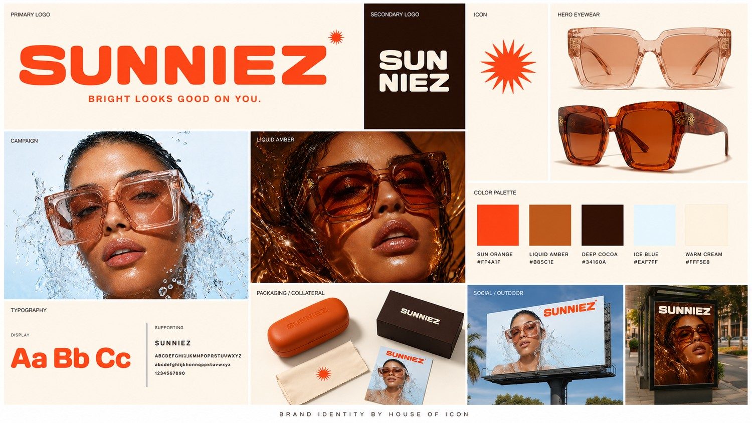
The full system: wordmark, starburst, palette, packaging, and the liquid amber campaign world.
What we built
The system, end to end.
The wordmark. Heavy, rounded, tightly set, with a terminal Z that gives the name its swagger. Rounded letterforms are warm without being soft, and at this weight the mark holds up printed small on a temple arm or blown up on a billboard.
The starburst. A single owned mark that works as a period at the end of the wordmark, as a standalone icon, as a repeating pattern on a cleaning cloth, and as a detail on the frame hardware itself. One shape doing five jobs is how a young brand builds recognition on a small budget.
The palette. Sun orange leading, liquid amber and deep cocoa carrying the depth, ice blue as the cold accent that keeps the warmth from going muddy, warm cream as the ground. The blue is doing more work than it looks like it is. Without one cool note the whole thing would read as a tanning brand.
The campaign world. Liquid amber, high gloss, close crops, light through the lens tint. Shot to look like the feeling of putting them on rather than a product on a plinth.
The line. "Bright looks good on you." It is about the wearer, not the product, and it works on a billboard, a box, and a receipt.
Fill in: one decision worth arguing about Every strong case study has a moment where the obvious choice was rejected. What did the client push back on, and what changed their mind? That paragraph is the one prospects remember. Delete this box before publishing.Where it landed
It does not look like anyone else.
Put the campaign next to the category and the difference is not subtle. In a grid of pale minimalism and flat fast fashion, an amber, liquid, close-cropped frame stops the scroll purely on temperature.
More usefully, the brand now communicates its own price logic. It looks like it costs more than it does, which is the most valuable thing an affordable product can achieve, and it never had to say the word affordable to get there.
This is a new brand and the long-term numbers are still being written. When they are in, they will be published here.
Want one of these?
Brand strategy, identity, and a website that actually goes live.