Most brand mood boards are gorgeous and completely useless. Pretty was never the assignment.
Here is how it usually goes. A founder opens Pinterest, saves ninety images she likes, screenshots the grid, and calls it her brand direction. It looks amazing. It also means nothing, because "things I like" is not a strategy, and a wall of pretty pictures cannot tell a designer, a printer, or a future version of you what to actually do.
A brand mood board done right is one of the highest-leverage hours you will spend on your visual identity. It is the difference between a brand that looks like one company everywhere it shows up and one that looks like a different business on every platform. Done wrong, it is a very stylish way to stall. Here is the difference, and the exact steps to build a mood board that earns its place.
What a brand mood board actually is
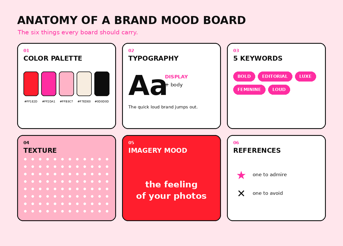
A brand mood board is a curated collection of visuals, colors, typography, textures, and words that defines the look and feel of your brand before you design a single real asset. Its job is alignment. It gives everyone touching your brand, you, a designer, a web developer, a photographer, one shared reference so every future decision points the same direction.
Notice what that definition does not say. It does not say "a collage of things you find beautiful." A mood board is a brief you can see. If it is not steering decisions, it is just decoration with extra steps.
Brand mood board examples: four color directions
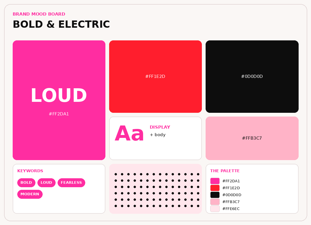
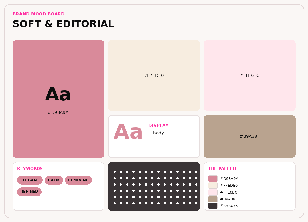
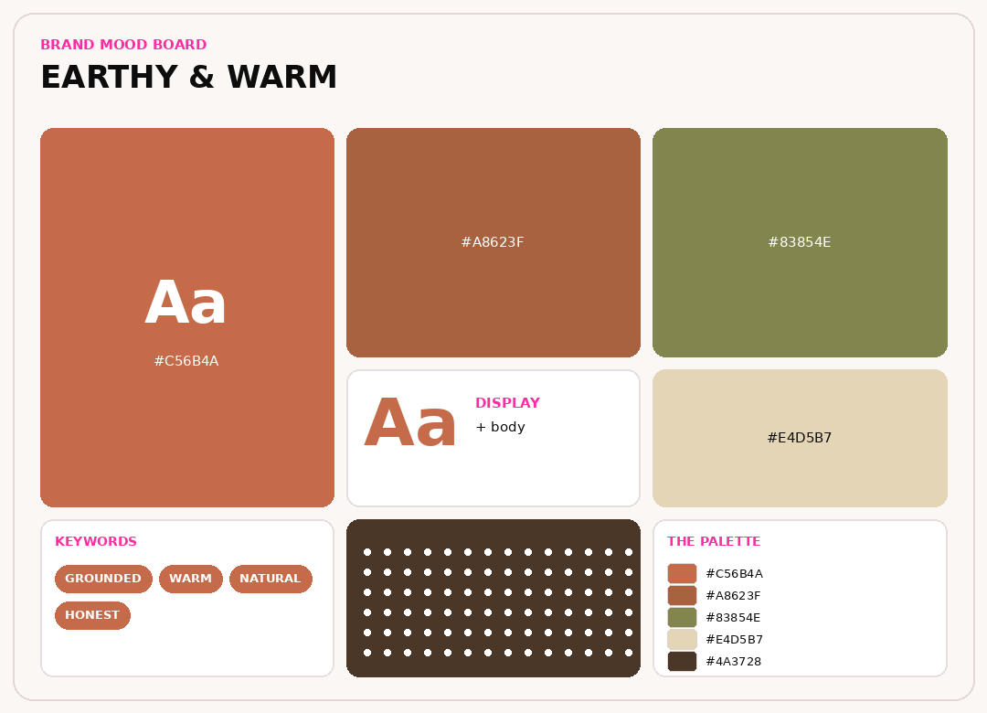
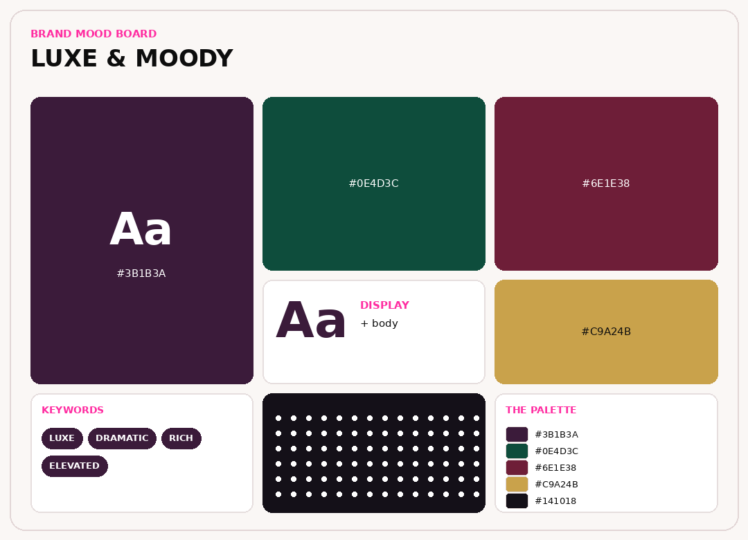
The fastest way to understand a brand mood board is to see a few. Here are four complete directions. Same six ingredients, wildly different feelings. Notice how much of the personality is carried by color alone.
Start with words, not images
The single biggest mistake founders make is opening Pinterest first. Images are seductive, and they will drag you toward whatever is trending instead of whatever is true to your brand. Start with language.
Write down three to five brand keywords, the adjectives that describe how your brand should feel. These are sometimes called aesthetic keywords, and they become the filter every image has to pass. A few to react to: bold, editorial, warm, luxe, playful, minimal, rebellious, feminine, futuristic, earthy, clean, moody, loud.
Pick words you can defend, not words that sound nice. "Modern" is a filler word; everyone thinks they are modern. "Rebellious and warm" is a point of view. Your five words are the whole game. Get them right and the board almost builds itself.
Stuck on your five words? Three fast ways to find them. First, write down what you are not. "Not corporate, not quiet, not safe" points you straight at the opposite. Second, borrow from outside your industry: a coffee brand that wants to feel like a nightclub, a law firm that wants to feel like a fashion house. The tension is where a brand gets interesting. Third, describe the exact feeling you want a customer to have the second they land on your page, then turn it into an adjective. "I want her to feel like the most powerful person in the room" becomes bold, confident, unignorable.
What to put on a brand mood board
A strong board is not just photos. It carries every ingredient your future brand will need to stay consistent. Include:
- A color palette. Three to five colors, ideally with a sense of which one dominates. Color is the fastest thing about your brand, so it earns real estate here.
- Typography. One display or headline face with personality, and one clean face for body copy. Even a screenshot of type you love counts. See typography with main-character energy for how to choose them.
- Imagery style. The mood of your photography: lighting, subjects, angles, how much white space, how much drama.
- Textures and materials. Marble, paper, matte plastic, foil, linen. Texture is what makes a flat brand feel like it exists in the real world.
- A logo or mark direction. Not your final logo, just the family it lives in: geometric, hand-drawn, wordmark, monogram.
- Your five keywords, written on the board. So nobody forgets the assignment halfway through.
- One brand you admire and one you refuse to look like. Contrast sharpens direction faster than praise ever will.
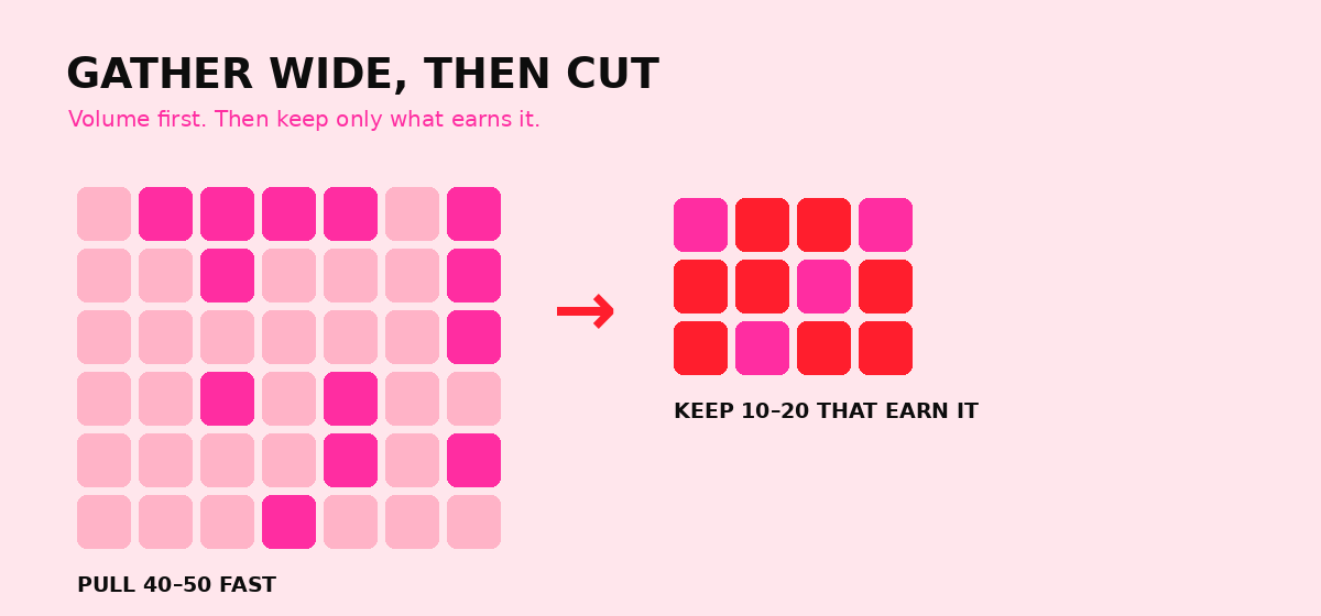
Ten to twenty strong ones. Not ninety. A cluttered board hides the direction instead of showing it. If you have fifty saved, your real job is cutting forty of them.
How to choose the colors for your mood board
Color is where most boards live or die, so it deserves its own pass. You are not picking a rainbow of shades you like. You are casting three to five colors and giving each one a job.
Every working palette has three roles. The dominant gets the most surface, and it is usually the quiet one: a soft neutral, a cream, a deep near-black. The secondary is the workhorse that structures your sections, cards, and packaging. The accent is the loud one everyone remembers, and it works precisely because you use it in small doses. A useful ratio to aim for is sixty percent dominant, thirty percent secondary, ten percent accent.
Warm or cool sets the emotional temperature before a single word is read. Warm palettes, think red, terracotta, and hot pink, feel energetic, human, and bold. Cool palettes, think deep blue, green, and plum, feel calm, premium, and trustworthy. Neither is better. Picking one on purpose is the whole point.
Here is the practical part: do not choose colors in a vacuum. Drop your three or four strongest images onto the board, then use a color picker, the eyedropper in Canva, Coolors, or any design tool, to lift the exact hex codes straight out of them. Real colors pulled from real images almost always beat colors chosen from a swatch menu. For the deeper rules on ratios and contrast, read color theory, but make it loud.
Squint at your palette. If two colors are fighting for attention, one of them is trying to be the accent when it should be a supporting player. Demote it. A palette with a clear pecking order saves you a hundred future arguments.
How to make a brand mood board, step by step
Here is the actual workflow, start to finish.
- Write your five keywords first. No images until this is done. This is the step everyone skips and everyone regrets.
- Gather wide and fast. Open Pinterest, Unsplash, or your own camera roll and pull forty to fifty images that react to your words. Do not overthink this pass; volume is the point.
- Cut ruthlessly. Go back and keep only the ten to twenty that truly represent the whole feeling. Kill anything you saved because it was pretty rather than because it was right.
- Add the non-photo ingredients. Drop in your color palette, type, and textures so the board is a full system, not just a photo wall.
- Arrange for contrast and hierarchy. Put your loudest, most on-brand image where the eye lands first. Group by feeling, not by color.
- Pressure-test it. Show it to someone who does not know your business and ask them to describe the brand in one sentence. If their sentence matches your five words, the board works. If not, keep cutting.
Five brand mood board mistakes to avoid
Most weak boards fail the same handful of ways. Dodge these five and you are already ahead of most brands twice your size.
- Starting with images instead of words. Without your keywords, you are just collecting pretty things. The words are the filter that turns a scrapbook into a strategy.
- Too many images. Ninety pins is a Pinterest habit, not a brand direction. Volume in the gathering pass, ruthless cutting after. Ten to twenty is the target.
- No color hierarchy. Five colors with no sense of which one dominates becomes a free-for-all the moment the brand goes live. Assign roles before you fall in love.
- Copying one brand you love. A board should be inspired by many things and identical to none. If a stranger can name the brand you borrowed wholesale, start over. Look like the best version of you, not a discount version of someone else.
- Never turning it into rules. A board that stays a board is a vibe, not a brand. The entire value is in what you build from it: a documented palette, a type system, and guidelines you actually follow.
The best tools for a brand mood board
You do not need fancy software. You need the right tool for the stage you are in.
- Pinterest is the gathering net. Unbeatable for the wide, fast first pass and for finding aesthetic directions you did not know you wanted.
- Canva is the presenter. When you want a clean, shareable board to put in front of a client or a designer, Canva assembles and exports it beautifully, and it is free to start.
- Milanote is the strategist's board. Built for research-heavy, open-ended creative work, it is where a lot of agencies build their most beautiful boards.
- Figma is for when you are ready to design the actual brand and want your board sitting right next to your work.
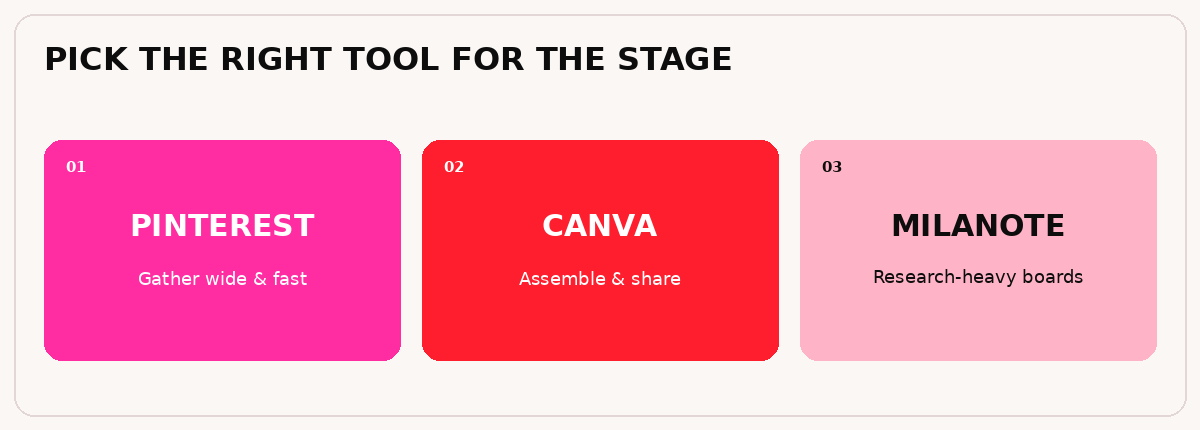
A workflow that works for most founders: gather on Pinterest, assemble the real board in Canva or Milanote, and keep the final version somewhere your whole team can see it.
How to turn a mood board into a brand
This is the step where most DIY brands quietly stall. A mood board shows the direction. It is not the brand. To become a brand, that direction has to harden into rules a stranger could follow: a color palette with exact codes and ratios, a type scale, image guidelines, and a logo built on purpose rather than on vibes.
The board answers "what should this feel like." The brand answers "what do we actually do, every single time." Skipping from the first to the last is exactly why so many businesses look slightly different in every place they show up, and why they never quite become recognizable.
Brand mood board FAQ
What is a brand mood board?
A brand mood board is a curated set of images, colors, typography, textures, and keywords that defines the look and feel of a brand before any final design is made. Its purpose is to align everyone on one visual direction so future decisions stay consistent.
What should a brand mood board include?
A color palette, one or two typefaces, an imagery or photography style, textures and materials, a logo direction, three to five brand keywords, and a couple of reference brands. In short, every ingredient your finished brand will need to stay consistent.
How many images should be on a brand mood board?
Ten to twenty strong images. Fewer, sharper choices communicate a direction far better than a crowded board of everything you liked.
What is the best tool to make a brand mood board?
Pinterest is best for gathering inspiration, Canva is best for a polished, shareable board, and Milanote is best for research-heavy, beautiful boards. Many founders use Pinterest to collect and Canva or Milanote to assemble the final version.
What is the difference between a mood board and a brand board?
A mood board captures the feeling and direction of a brand. A brand board, or style guide, is the finished set of rules: exact colors, fonts, logo usage, and spacing. The mood board comes first and inspires the brand board.
Do I need to be a designer to make a brand mood board?
No. Anyone can build a strong mood board with clear keywords and free tools like Pinterest and Canva. The strategy, choosing the right words and cutting to the strongest images, matters far more than design skill.
How long should it take to make a brand mood board?
An hour or two for a focused first pass. It is not a week-long project. If you are still gathering images after a few hours, you are avoiding decisions rather than making them. Set a timer, gather fast, then cut.
Should a brand mood board be digital or physical?
Digital is faster to build, share, and update, and it is what most brands use through Pinterest, Canva, or Milanote. A physical board pinned to a studio wall can be powerful for an in-person team, but for almost everyone, digital wins.
Pin with intention. Bland is banned.
Brea
Free · 15-minute brand audit
The Icon Factor™
See how your brand scores across 5 pillars, and exactly what’s keeping you from standing out.
Grab Your Free Audit →Keep going
- Want your mood board turned into a real, documented brand? Meet the agency.
- Want to build your whole brand and website in thirty days? Brand Camp.