Ask a founder about their brand and they will talk about color for ten minutes. Ask about typography and you get a shrug and the word "clean."
Which is strange, because type is doing more work than any other element in your identity. It is present on literally every surface you own. It carries the words, so it is inseparable from your message. And it communicates class, era, confidence, and price point before a single sentence has been read.
You do not choose a font. You cast one. Same as casting a lead: you are looking for someone who can carry the whole thing, hold the audience, and still be recognizable in a crowd.
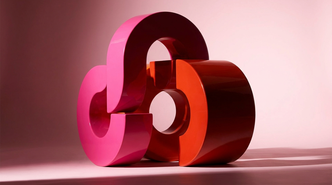
What type actually says before you read it
Every typeface arrives carrying baggage from where it has been. This is not mystical, it is just association built up over decades of use.
Geometric sans-serifs read modern, efficient, slightly cool. They dominated the last decade of technology branding so thoroughly that they now also read "startup," which may not be the message you want. Old-style serifs read established, considered, editorial, and they have come roaring back precisely because everything else went sans. High-contrast display serifs, the kind with hairline strokes, read luxury and fashion, and they collapse into illegibility at small sizes, which is why they belong in headlines and nowhere near a form field.
Then there is the heavy display category. Wide, tight-set, uppercase, immovable. It reads confident, loud, and unapologetic, which is why it shows up on brands that want to occupy space rather than politely request it. That is the family we build on here, and it is not an accident.
Grotesques and neo-grotesques read neutral and Swiss and can be excellent, but be honest about why you are choosing one. Sometimes it is rigor. Often it is fear.
Two typefaces. Occasionally three. Never five.
The most common typography mistake is not picking the wrong font, it is picking too many.
A working system needs a display face for headlines, where personality lives, and a text face for body copy, where legibility is the only virtue that matters. That is it. A third face is justified only for a specific functional job, monospace for data, for example, and it should be an obvious tool rather than a third personality.
The pairing rule that has never failed me: contrast in character, agreement in proportion. Your display and text faces should feel clearly different in personality, a heavy display against a clean neutral text face, but share compatible x-heights and widths so they sit together without looking like an accident. Pairing two faces that are almost the same is the worst outcome, because it looks like a mistake rather than a decision.
If you want the shortcut that always works: one face with real attitude, one face that shuts up and does its job.
Pairing
Contrast in character. Agreement in proportion.
Two faces that are nearly identical read as a mistake. Two that are clearly different read as a decision.
- One display face with real attitude
- One text face that shuts up and works
- Contrast in character, agreement in proportion
- A third face only for a functional job
- Two faces that are almost the same
- Five personalities in one system
- A display serif set at 14 pixels
- A family without the weights you need
Build a scale, not a pile
Most brands have fonts. Very few have a type system, and the difference shows up on every page.
A scale is a fixed set of sizes with a consistent ratio between them, so a headline relates to a subhead relates to body copy mathematically rather than by vibes. Pick a base size for body copy, something around eighteen or nineteen pixels for comfortable reading on the web, then step up by a consistent multiplier. A ratio somewhere between 1.25 and 1.5 covers most brands. Tighter feels calm and editorial. Wider feels dramatic and loud.
Then commit to it. Six sizes. When somebody needs a size that is not on the scale, the answer is no, and the layout gets fixed instead. This one discipline is the difference between a website that looks designed and one that looks assembled.
- Line length. Aim for roughly sixty to seventy-five characters per line for body copy. Longer and the eye loses its place returning to the left margin. This is why serious editorial layouts have narrow columns, and it is the single easiest readability win available.
- Line height. Body copy wants roughly 1.5 to 1.8 times the font size. Big display headlines want the opposite, often below 1, tightly stacked, so the words read as one shape.
- Letter spacing. Large type usually needs slight negative tracking to stop looking loose. Small uppercase always needs positive tracking to stay readable. These two adjustments alone make amateur typography look professional.
Six sizes. That is the whole system.
Build a scale, not a pile
Pick a base for body copy, then step up on a fixed ratio between 1.25 and 1.5. Tighter feels editorial, wider feels dramatic.
The licensing conversation nobody has until it is too late
This is the boring section that saves people from genuinely serious problems, so please read it even though it has no jokes.
Fonts are software, licensed rather than bought, and desktop licenses do not automatically cover everything you want to do. A standard desktop license lets you set type in design files. It frequently does not cover embedding the font in a website, which requires a separate webfont license usually priced on monthly pageviews. It often does not cover embedding in an app, or in a product interface, or distributing it to a manufacturing partner who prints your packaging.
The failure mode is predictable and expensive: a brand launches, grows, exceeds the pageview tier it never read, and receives a letter. Or a foundry notices its face on a product it was never licensed for. These are civil matters with real numbers attached, and "our designer picked it" is not a defense.
So before you fall in love, check three things. What does the license cover, what are the traffic or seat limits, and who is responsible for renewing it. If a font is central to your identity, buying a perpetual license with generous terms is money well spent. If budget is tight, the quality of well-maintained open-source families has become genuinely excellent, and there is no shame in that lane whatsoever.
Set your real content in it. Not "The quick brown fox." Your actual headline, your actual product names, your actual longest paragraph.
Check the numbers and symbols. Many display faces have gorgeous letters and hideous numerals. If you show prices, this matters daily.
Check the language coverage. If you serve any market with accented characters, confirm they exist and are well drawn.
Look at it small and on a phone. Most of your audience meets your brand at fourteen pixels in bad light.
Confirm the weights you need exist. Falling in love with a family that has three weights when your system needs five is a slow, grinding problem.
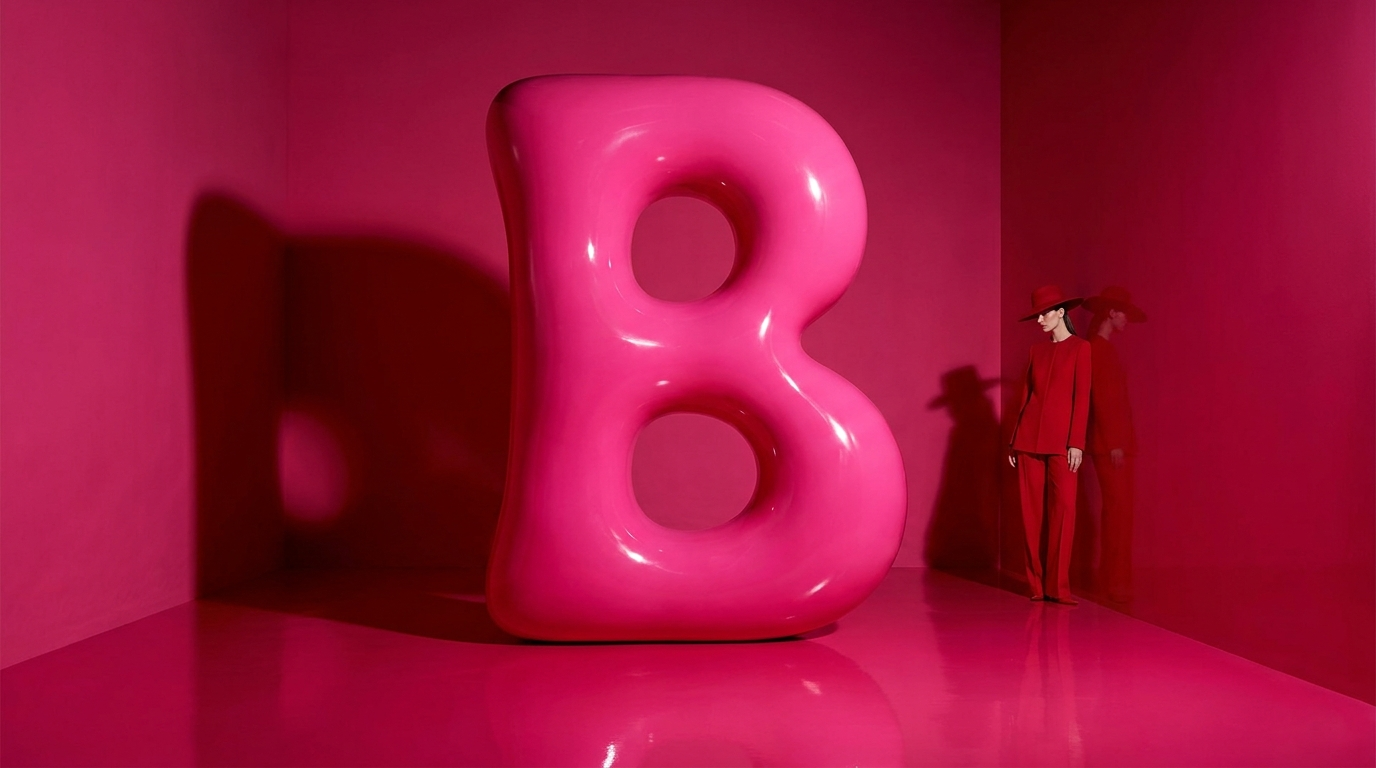
Give one letter a job
Here is the fun part, and the thing that turns type from functional to memorable.
Find one small typographic gesture and make it yours. A particular ligature. A dropped counter. An asterisk that replaces a dot on an i. A single letter that gets treated differently every time it appears in your name. It costs nothing, it repeats endlessly, and it gives people something specific to recognize.
These details are what separate a brand that uses a nice font from a brand that has typography. The font is available to everyone. What you do with one letter of it is not.
Variable fonts, and why your site got faster
One genuinely useful technical development worth knowing about, even if you never touch the code.
Traditionally, every weight and style of a typeface was a separate file. A brand using five weights plus italics loaded ten files, and every one of them cost the visitor time. Variable fonts collapse that into a single file containing a continuous range, so you can load one asset and access every weight between thin and black, plus width and other axes depending on the family.
Two consequences matter to you. First, performance: fewer files means a faster site, and site speed affects both search ranking and how many people stay long enough to read anything. Second, expressiveness: you are no longer limited to the five weights someone else chose. You can dial in exactly the weight a headline needs.
If you are choosing a typeface for a brand that will live primarily online, ask whether a variable version exists. It is not a dealbreaker if it does not, but it is a genuine advantage when it does.
Then hold the line
Typography systems decay faster than any other part of an identity, because everyone in the company touches type and almost nobody thinks of themselves as touching the brand when they do it. A deck here, an email there, a social graphic made on a phone at a conference.
So make it easy to comply. Build the templates. Install the fonts on every machine that needs them. Write down the five rules that matter most and put them where people actually look. A system nobody can follow is a system that does not exist.
Get this right and your brand becomes recognizable in text alone, with no logo, no color, no image. That is the highest compliment typography can pay you, and it is completely achievable if you treat casting as seriously as you treat everything else.
Set it loud.
Brea
Free · 15-minute brand audit
The Icon Factor™
See how your brand scores across 5 pillars, and exactly what’s keeping you from standing out.
Grab Your Free Audit →Keep building
- Want a full type system, documented? Meet the agency.
- Want to build one yourself? Brand Camp.