August is peak brand energy. The light goes golden, everyone is squinting at a pool, and your feed is begging for color. Here are four palettes worth stealing.
Here is the good news: you do not need to rebrand to feel like summer. A brand with a strong identity can borrow a seasonal palette for a campaign, a launch, or a content series and put it away again in September. It is a guest, not a new tenant.
These four August palettes are pulled from the places summer actually lives: a Palm Springs pool deck, a Tulum beach club, a yacht at golden hour, and a barely-there stretch of coastline. Each one comes with hex codes so you can use it today. And they are right on trend. The color reports for summer 2026 are leaning hard into turquoise and blue, coral, butter yellow, and pale pink, which is exactly where these land.
Why a seasonal palette works without a rebrand
Your core brand palette is your identity, and you do not touch it. A seasonal palette is a container play. You apply it to something with a start and an end date: an Instagram grid refresh, a summer product drop, an email series, a launch landing page, a limited run of packaging.
The trick that keeps you from looking like a different company: anchor with one of your real brand colors first, then let the seasonal shades come in as accents and backgrounds. You stay recognizably you, just dressed for the weather.
Palm Springs Poolside
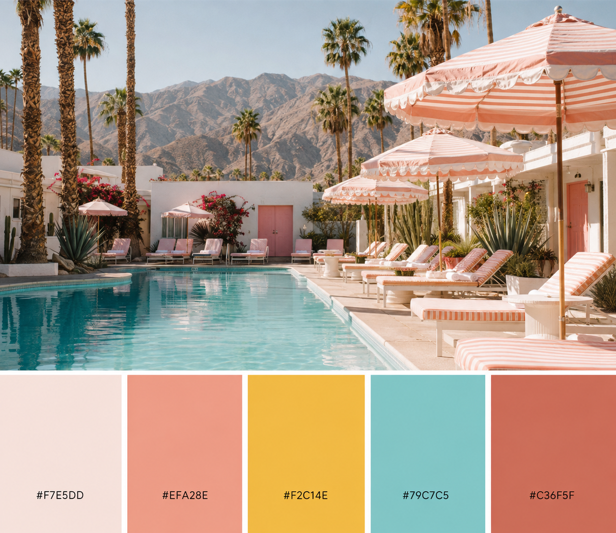
Hex codes: #F7E5DD · #EFA28E · #F2C14E · #79C7C5 · #C36F5F
The feeling. Retro desert glamour. Warm apricot and marigold play against pool teal and a grounding clay. Sun-drenched, a little disco, impossible to feel sad in.
Best for. beauty, hospitality, events, and any lifestyle brand that wants to feel like a genuinely good time.
Tulum Sands
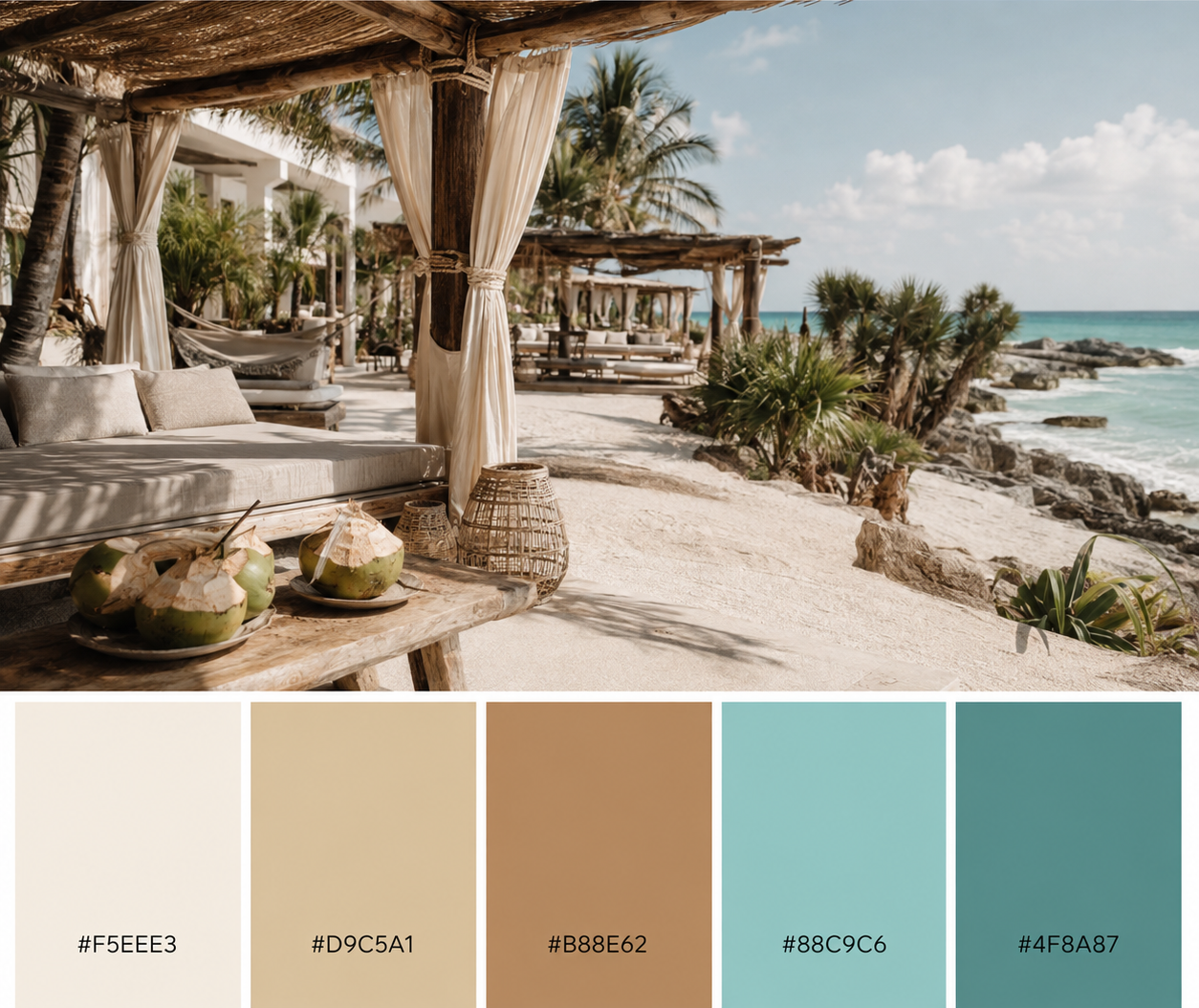
Hex codes: #F5EEE3 · #D9C5A1 · #B88E62 · #88C9C6 · #4F8A87
The feeling. Elevated bohemian. Bone, wheat, and caramel grounded by seafoam and a deep teal. Organic, calm, and quietly expensive.
Best for. wellness, skincare, retreats, and sustainable or slow-living brands that sell warmth and trust.
Yacht Club
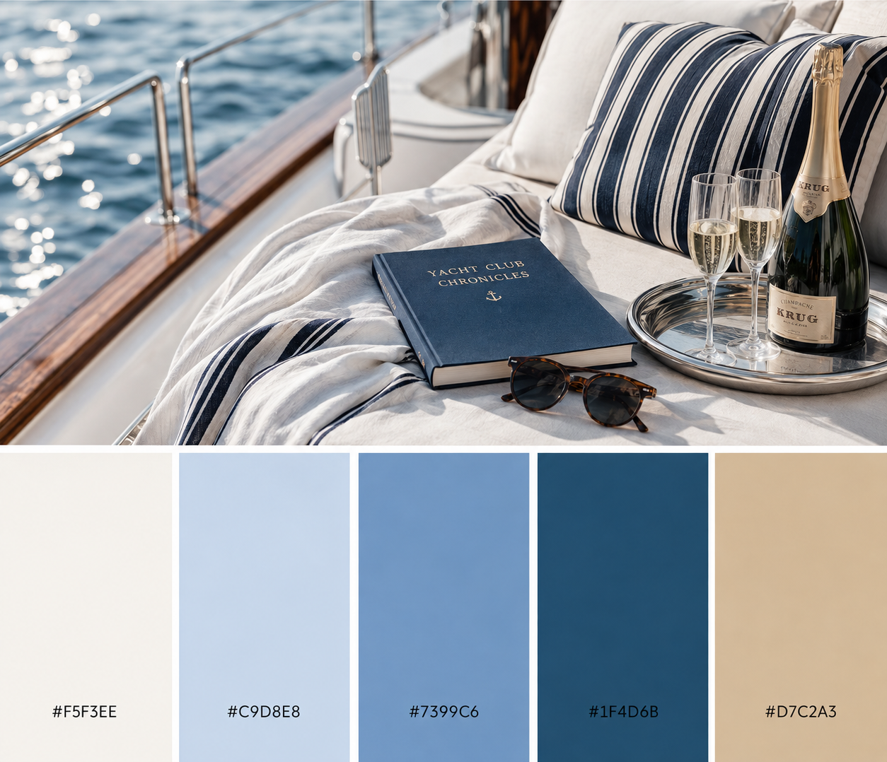
Hex codes: #F5F3EE · #C9D8E8 · #7399C6 · #1F4D6B · #D7C2A3
The feeling. Preppy and timeless. Crisp ivory and sand carry three blues that run from sky to deep navy. Classic, trustworthy, coastal-luxe.
Best for. finance, consulting, premium services, and heritage brands that want polish without the stuffiness.
Coastal Calm
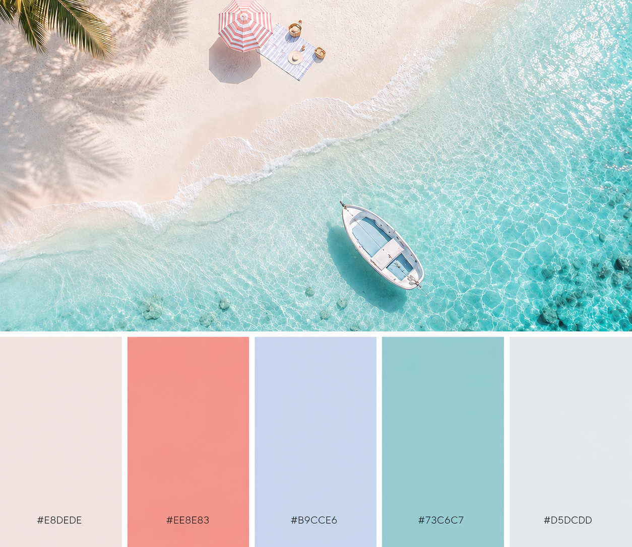
Hex codes: #E8DEDE · #EE8E83 · #B9CCE6 · #73C6C7 · #D5DCDD
The feeling. Airy and fresh. Soft rose-grey and mist with a single coral pop and clear-water aqua. Breezy, light, effortless.
Best for. clean beauty, travel, and soft-feminine wellness brands that want calm with one bright note.
How to use a seasonal palette without a rebrand
Loving a palette is easy. Using it without diluting your brand takes a little discipline. Five rules:
- Anchor with your brand color first. Lead with one shade that is already yours, then invite the seasonal colors in around it.
- Pick one accent, not five. Choose a single seasonal color for buttons, highlights, and links. The rest are supporting players.
- Let the pale one do the heavy lifting. The lightest swatch in each palette is your background and breathing room, not a headline color.
- Apply it to a container, not the core. A campaign page, a story-highlight set, a product line, an email header. Never the logo.
- Set an end date. A seasonal palette is a season. Enjoy it, then put it away so it stays special.
Even a borrowed palette obeys sixty-thirty-ten: a dominant, a secondary, and one small accent. If you want the full breakdown, read color theory, but make it loud, and if you are building a palette from scratch, start with a mood board.
August color palette FAQ
What colors are trending for August 2026?
Summer 2026 color is leaning into turquoise and blue, coral and persimmon, butter yellow, and a pale pink that behaves almost like a neutral. All four palettes here pull from those families.
What is a good summer color palette for a brand?
A strong summer palette pairs a couple of warm neutrals with one or two saturated accents, so it feels seasonal without becoming a costume. Palm Springs Poolside and Tulum Sands are two ready-made examples with hex codes above.
How many colors should a brand palette have?
Three to five, with a clear sense of which one dominates. Each palette above gives you five: a light neutral, a mid neutral, and a few accents to choose from.
Can I use a seasonal palette without rebranding?
Yes. Keep your core brand colors as the anchor and use the seasonal shades as accents on a campaign, a social refresh, or a product launch. It is a temporary layer, not a new identity.
Where do I use these hex codes?
Drop them into your design tool of choice, Canva, Figma, or your brand kit, and assign roles: one dominant, one secondary, one accent. Then apply that set to whatever seasonal thing you are building.
Steal the sunshine. Bland is banned.
Brea
Free · 15-minute brand audit
The Icon Factor™
See how your brand scores across 5 pillars, and exactly what’s keeping you from standing out.
Grab Your Free Audit →Keep going
- Want a palette built and documented properly for your brand? Meet the agency.
- Building your brand from scratch? Start with a mood board, then Brand Camp.